‘Magic with brush and colour’: on draperies and painting ‘after nature’ by the old masters
Translated in juni 2025 from Dutch in English (British) with DeepL.com
Once - a really long time ago, I was in my twenties - I stood in front of a painting by Jan van Eyck at the Groeninge Museum in Bruges: The Madonna with Canon Joris van de Paele (fig. 1). The latter is the patron of the work and grandly depicted on the left. A work made in 1436! - mind you - in oil paint where Mary sits elevated on a throne. At her feet Van Eyck paints a carpet. He drapes it in an intricate pattern over the edge of the elevation. A particularly loved and world-famous work in beautiful colors, I immediately fell for that tapestry. Because, did I see it good?, that seems really a high-pile, even when I’m standing with my nose on it. How do you express that in - just - paint?

Fig. 1. Jan van Eyck, Madonna with Canon Joris van der Paele, 1436, oil on panel, 122 x 157 cm, Bruges, Groeninge Museum
How do they do this anyway?
After that first experience and then also through my art history studies, which I started part-time in 2010 and completed with a master's degree in 2018, I often stand in museums with my nose on works by masters and always wondered, ‘How do they do it?!’ Most fascinating to me is how to represent three-dimensionality on a two-dimensional surface. I also still wonder how to express movement in paint, on a canvas and in a painting that is a two-dimensional static whole. And how do you also manage to create the suggestion of satin or velvet. Incredible, I thought, and I still think so.
Painting class
So after graduating in September 2018, I went looking for someone who can teach me that technique of painting in oils. I want to get to the bottom of that. In Voorburg, visual artist Anja Jager turns out to teach tempera and oil painting techniques. Tempera is a very old technique that, incidentally, is still in use and may have been invented in Roman times in Egypt. Mummies have been found painted with tempera. For tempera, powdered pigments - derived from organic and inorganic materials - are mixed with a mixture of egg yolk and water. In Byzantine times, artists use tempera for painting icons and in the early modern era, from the 14th century onward, also for frescoes - wall paintings - and for work on panel. Tempera produces beautiful bright colors, but you can not mix them well while painting on panel or canvas because the paint dries quickly.
Tempera and oil painting
From the fourteenth century on, oil painting spreads from north to south across Europe. It has been long thought that ‘our’ Jan van Eyck was the inventor of this, but it turns out to be a very old technique that can be said to have been reinvented by van Eyck in the fourteenth century and slowly finds its way to Italy. Oil paint dries slowly and you can mix it well on the support, for example on panel or canvas, so you can paint beautiful transitions in fabrics and other curves, like skin. You can also use it to paint precious metals and shiny objects such as glass, metal, pearls and gemstones. With tempera, gold leaf has been used where - for example - the Madonna had to shine, and real gemstones are also applied for the luminous effect, either on the work itself or on the frame. With oil colors, the gloss also gives extra depth to dark colors in particular, especially if varnish is applied on top (figs. 2, 3).

Fig. 2. Lavinia Fontana, The visit of the Queen of Sheba to King Solomon, 1599, oil on canvas, 251.7 x 326.5 cm, Dublin, National Gallery of Ireland, detail; the fabrics gleam at you as do the many pearls

Fig. 3. Duccio, The Crevole madonna, 1284, tempera with gold background on panel, Siena, Museo dell'Opera; here the entire background is gold leaf to make the madonna ‘shine’
From two-dimensional to three-dimensional
What I had already learned while studying art history was that by inventing all kinds of perspective tricks, the suggestion of three-dimensionality could be created on the painting canvas. And that is what we are talking about: suggestion - creating an illusion in 3D. This can be done in various ways, for example by using line perspective: making different lines run away in one or more vanishing points; or with an atmospheric perspective: a technique to blur colors; you see this a lot in painting landscapes. Another way is by rendering figures and objects larger in the foreground and smaller towards the background, or figures and objects sharp and detailed in the foreground and less detailed and blurred in the background. You can also work with nuances in color - playing with different shades of a color from light to dark and vice versa. When painting fabrics and draperies - the actual subject of this article - it is mainly this latter variation that I want to focus on (figs. 4, 5).

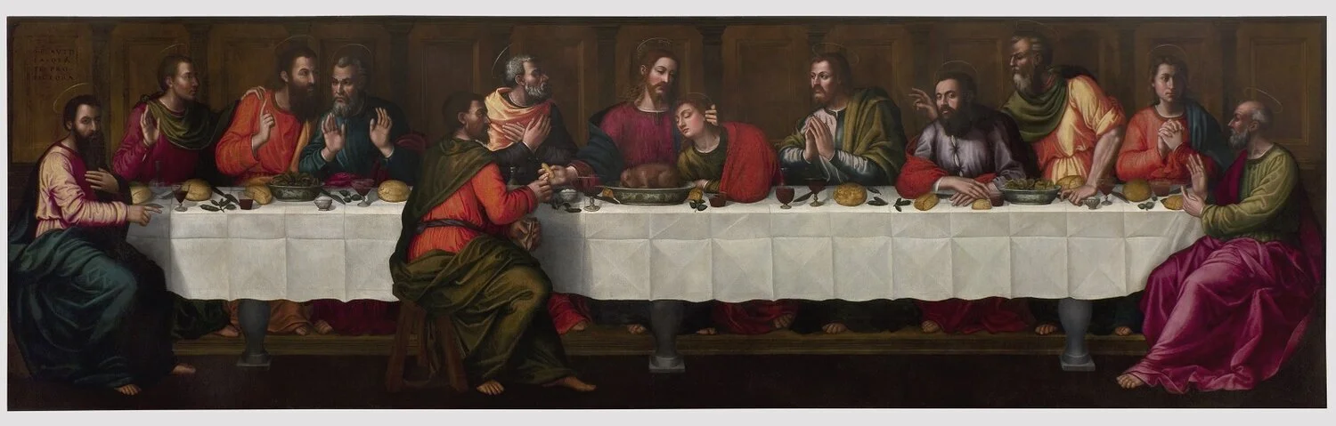
Fig. 4. Leonardo da Vinci, The Last Supper, 1495-1498, fresco, 460 x 880 cm, Milan, Santa Maria della Grazie; a fine example of linear perspective. The head of Jesus is the vanishing point, painted by Leonardo precisely on the horizon behind it.

Afb. 5. Rogier van der Weijden, Maria Magdalena, onderdeel van de triptiek Maria Magdalena, Christus als de redder van de wereld en H. Johannes de Evangelist, ca. 1450-1452, olieverf op paneel, 41 x 35 cm, Parijs, Louvre. Hier slaat Rogier van der Weyden twee vliegen in één klap: hij gebruikt atmosferisch perspectief door op de voorgrond donkere kleuren te gebruiken die hij lichter laat weglopen naar de achtergrond en daarnaast maakt hij de figuur op de voorgrond groot en laat hij de rest van de voorstelling steeds kleiner worden naar de achtergrond
Painting became a science
Painting became a science in search of the right proportions, often calculated mathematically. At what place in the face are the eyes and how do they relate to the place in the face of the nose and mouth. And what is the ratio of the human figure's limbs to the torso. ‘Shortening’ was invented, a form of perspective for anything in the viewer's direction of view. If a body part protrudes forward from a certain angle, as a painter you have to do something with it: shorten that part to still achieve a realistic rendering. A famous example is the painting The Lamentation of Christ - irreverently called ‘The Shortened Christ’ in art-historical vernacular - by Italian court painter Andrea Mantegna (1431-1506) from Mantua. Mantegna greatly shortens Christ's body because he wanted maximum dramatic effect: by bringing Christ so close to the viewer, who is standing at the foot of the table, Mantegna draws them into Mary's grief and mourning, as it were (fig. 6).

Fig. 6. Andrea Mantegna, The Lamentation of Christ, c.1470-1474, tempera on canvas, 68 x 81 cm, Milan, Pinacoteca di Brera
And what about the incidence of light? What place is the work intended for? Does it hang high or at eye level, because that has consequences for the proportions of the figures and objects. If so, reducing the perspective is often necessary. Rembrandt's Night Watch was intended for a higher place in a room of the Kloverniersdoelen. Now it hangs lower in the Rijksmuseum. Perhaps that's why the main figure in yellow doesn't seem quite in proportion, as it looks a bit small in relation to the rest, in my opinion.
Carriers and pigments
In addition, much knowledge was needed about the preparation of the supports - that on which the painting was made; panel, canvas, metal, glass - and the preparation of the pigments that did not come out of a tube as luxuriously as nowadays - that was only invented in the late nineteenth century. The Florentine artist Cennino Cennini (c. 1360 - before 1427) wrote a manual for the artist in the early fifteenth century: Il libro dell'Arte (The Book of Art). The book is a fantastic source of information about the working methods of artists back then, full of technical tips on how to paint, how to prepare a support and what materials to make and use, such as brushes. Cennini also gives recipes for making colours, as below for ultramarine (blue):
‘Take a bit of mashed kermes (a red colour made from an insect) and a bit of brazil (presumably a red stone or plant/root from Brazil)), grate the brazil or scrape it with glass and boil them together with lye and a bit of stone alum. And when they cool, you will see that it is a perfect crimson. When the blue is dry from the lye add a little of the kermes and brazil and stir well with your finger. Let the mixture stand until it is dry, then put it in a leather pouch and leave it alone because it is now good and perfect. And keep it for yourself because it is a special ability to know how to make this the right way.’(sic)
Below this recipe in Cennini's book is a special addition that I discovered by chance:
‘And know that making this is an occupation for pretty girls, more than for men; they are always at home and reliable and they have finer hands. But beware of old women.’
What this tells us - and we know this by now - is that girls' and women's freedom of movement was very limited in Cennini's time. But this observation also shows that in this area women contributed, albeit invisibly, to the work.
Getting started myself
I had no desire to create my own image when choosing a subject.What I much preferred to do was to take a detail from a work I admired, I could enjoy its beauty extra while painting.You could say that my ‘invention’ - my own input - was the choice of a particular detail. And what transpired along the way? I intuitively chose to depict drapery again and again. Call it fabrics, pleats, folds. Inspired by the many beautiful robes, carpets and headdresses painted by artists from the late Middle Ages onwards in their attempt to depict more and more ‘after nature’; as reality unfolds before your eyes. Sometimes partly with a face or limb added, but each time the emphasis was on the fabric. Only recently I realised that I was combining two things: my love for fabrics - their fall and touchability - and my love for the beauty of ancient visual art.
I started working on small 20 x 20 cm canvases. My first piece became a detail of a work by Jan van Eyck. I learned at painting class how to prepare a canvas or panel, the support, with a primer of gesso - a primer of chalk paint - to make the surface smooth (which is not necessary if the support is already prepared when you buy it). I learned how to apply a second coat in an intermediate shade, usually a mixture of titanium white, raw umber and two types of paint thinner. I learned to transfer the chosen image of which I first made a black-and-white copy - to the medium. My teacher told me to forget the image and focus only on the planes that make up the image. The function of the black-and-white copy is that you can see the contrasts in light and dark best.
I learned how to build up an underpainting in greys - titanium white and raw umber - by starting to fill the planes, working from the darkest to very lightest part and letting all the shades of grey flow into each other by adding more or less paint - a tricky but rewarding job if you succeed. And I learned that after the first layer dries, you can apply another layer over it, in which you can further increase or decrease the contrasts until you reach the optimal underpainting. Finally, I learned to add colour using the colour copy of the subject as an example. And that turned out not to be so easy: mixing colours in such a way that you arrive at the right shade of colour is almost a science. Especially skincolour, made up of different colours, is tricky, everyone struggles with it. I experienced it all full of wonder and found it ‘magic’ (fig. 7 a, b).

Fig. 7a. Jan van Eyck, Portrait of a man with a red turban (self-portrait?), 1433, oil on panel, 26 x19 cm, London, National Gallery, with cutout

Fig. 7b. My cut-out (see at Fig. 7a): left: first stage, the underpainting; right: the work is finished. Mélanie Struik, oil on canvas, 2019, 20 x 20 cm.
Sketches by famous masters as examples
I keyed in the keyword ‘drapery’ on the internet and came up with the most beautiful sketches in art history. Sketching was an important exercise for artists to get to the right proportions, nude or clothed. And so depicting draperies was also well practised. This applied to all artists, including the very great ones like Michelangelo or Leonardo (figs 8, 9 a,b).

Fig. 8. Left: Leonardo da Vinci et al, Madonna of the Rock, c. 1485-1508, oil on panel, 189,5 x 120 cm, London, National Gallery; the yellow frame indicates the seated angel Leonardo elaborated on in the sketch, to see in the yellow frame on the right image: Study for a drapery for the kneeling angel for The Virgin on the Rock in the National Gallery in London, c. 1494-1498, charcoal on paper or parchment, dim.?, Paris, Louvre; the large image on the right shows my rendering of Leonardo's sketch. Mélanie Struik, oil on canvas, 2021, 20 x 20 cm

Fig. 9a. Left: Michelangelo, Drapery study for the sybille of Erythrea, 1508, charcoal on paper, 38,4 x 25,8 cm, London, British Museum; right: my version: I omit the upper body and legs. So it becomes a sculpture in space, a grisaille in oil paint, 20 x 20 cm, 2019

Fig. 9b. Michelangelo, Sybille of Erithrae, 1508-1512, fresco, Rome St Peter's/Sixtine chapel, the frame shows the section for which Michelangelo made the drapery study of a seated figure for
The ‘Drapé’ exhibition in Lyon
And then, in January 2020, I saw the announcement of an exhibition in Lyon entitled Drapé - yes, about drapes, that is. Surely I had a subject to tackle if a major exhibition was dedicated to it, it turned out. Of course I went there, hubby wanted to come along. Lyon is a nice destination and the corona pandemic had not yet sunk in (Fig. 10).

Fig. 10. Front cover of the catalogue of the 2019-2020 Lyon exhibition, a work by French painter Edgar Degas (1834-1917), Drapery study for a kneeling woman, s.j., watercolour, Paris, Musée d'Orsay
On a roomtext I read:
‘The words ‘draperie’ and ‘draped’ have been part of the vocabulary of art history since the Renaissance. They were defined in the first edition of the ‘Dictionnaire de la Academie Francaise’ in 1694: ‘ce terme de draperie’: la representation de étoffes et des habits. The term ‘draperie’ also applies to a represented or imitated garment (or fabric). The fact that the term was defined in the seventeenth century does not mean that the object ‘drapery’ did not exist before. In all periods of art history, in all civilisations and in all artistic techniques, drapery has existed. What work of art does not include a draped figure, moving or static, a piece of fabric in the foreground or a hanging curtain in the background?’
The exhibition mainly shows the development and process of drapery creation, from Byzantine times, through North Africa and the Renaissance to the present day: how were draped forms conceived or designed, what accessories were used and what were the practices in the studio. Of course I bought the catalogue - still a great source of inspiration for me.
For instance, I learnt that artists used mannequins, so called member dolls - as a tool as early as the 16th century. These were and still are models of the human figure in proportion, often made of wood. The limbs could rotate and hinge in all directions. They were used as a substitute for living models. This saved both for the model and the artist: the model did not have to sit endlessly in a certain position, and for an artist it was obviously much cheaper. The fabrics for a drapery were then applied to the member doll (figs 11, 12).

Fig. 11. Chrispijn de Passe II, Model of a mannequin, published engraving from La prima parte della luce del dipingere et disegnare nelle ovale, Amsterdam, 1643, in-folio, in volume IV: De la lumiere di le art de deseigner et de la peinture. Paris, Bibliothèque de l'Institut national d'histoire de l'art

Fig. 12. Laurent De La Hyre (vicinity of), The studio of Laurent De La Hyre, after 1630, oil on canvas, 51 x 68 cm, Brussels, Museé d'Ixelles; if you pull the image closer you can see a draped fabric around a seated member-doll on the left behind
At the exhibition and also in the catalogue - from which I got these images - I found a fantastic example of the preparation and realisation of a figure with a drapery. Figure 13 shows in three stages how this works. On the left, you can see that the painter uses a grid paper and sketches a quite idealised male body. In the middle, you can see why he needs that body first: to intend the fabric will fall around the body in a realistic way. Next to it, the drapery worked out in oil paint.

Fig. 13. Left: Francois-Xavier Fabre, Study of a male nude, 1790-1791, with red chalk on cream-coloured grid paper, Montpellier, Musée Fabre; centre: idem, charcoal with white chalk on beige-coloured paper, Montpellier, Musée Fabre; right: Francois-Xavier Fabre, Fragment of a tableau depicting ‘the prophecy of Saint John the Baptist’, oil on canvas?, 1790-1792, Arles, Musée Réattu
On the right of fig. 13, you can see the final result, and in an unusual way: unfinished. The work was intended for a chapel of the Penitents blue - a French monastic order - of Montpellier. The order was dissolved in 1792 and the patron died in the same year so the work was cancelled. What this unfinished work shows us in a very special way is how the painter worked. You can see the signature sketched out, after which the artist probably elaborated the work from top-left to bottom-centre. Also special is the empty part, as many as two small pieces have been worked out. There is no use of a dark underlay here, as is often the case, and on which the underdrawing is then applied. I have rarely seen such a fine example of the making process.
Movement on 2D
We are almost there! The back of the exhibition catalogue inspired me immensely. What an image! A flapping canvas. This made me realise: how on earth do you get the suggestion of movement on a canvas. I thought this was such a beautiful image that I started painting it myself. It turns out to be a preliminary study for a detail in a somewhat lurid work by eighteenth-century French painter Anne-Louis Girondet de Rousy -Troison: Une scène de déluge (The Flood) (figs 14, 15, 16). For the detail I wanted to paint, I limited myself to the left part of the sketch on the back of the catalogue. I now have this work - besides once in 20 x 20 cm - in a 100 x100 cm format on the easel and it is almost finished. I can't get enough of it.

Fig. 14. Left: the sketch at the back of the exhibition catalogue; right: the original preliminary study of the drapery by Anne-Louis Girodet Rousy-Trioson, Draperie volante (flapping canvas), Study for the group of sons carrying their father in a Deluge scene, 1802, Nantes, Musée des Arts de Nantes

Fig. 15. Left: Anne-Louis Girondet de Roussy-Trioson, (school of), Une scène de déluge, 1806, 441 x 341 cm, oil on canvas, Paris, Louvre, with cut-out; right: my result, here. Mélanie Struik, oil on canvas, 2022, 20 x 20 cm.

Fig. 16. and the same picture in a larger format on the easel, almost finished. Mélanie Struik, oil on canvas, 2025, 100 x 100.
I have ever since received a number of answers to my question from the beginning ‘how do they do it?!’And each time I am fascinated by the process of painting and getting from nothing to a realistic thing on a canvas. My admiration for the artists of the past, when everything still had to be invented, has only increased. And I will keep on studying and painting. I hope that all this information will enrich your reader's view when contemplating a painting from earlier times - and, of course, beyond.
Finally: the Gallery
Below is an overview of the works I have painted as of 2018 with the works of art history from which they are derived, the original at the left with a frame indicated to the detail I painted.

Fig. a. Jan van Eyck, Arnolfini portrait, 1434, oil on panel, 81.8×59.7 cm, London, National Gallery; right, my cutout. Mélanie Struik, oil on canvas, 2019, 20 x 20 cm.

Fig. b. Francisco de Zubaran, The Virgin of the Caves, 1655, oil on canvas, 267 x 320 cm, Seville, Museo Belles Artes de Sevilla; right my cut-out. Mélanie Struik, oil on canvas, 2021, 20 x 20 cm.
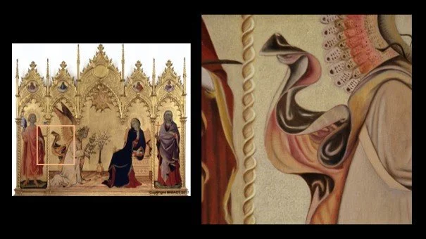
Fig. c. Simone Martini and Lippo Lemmi, Annunciation and two saints, 1330, tempera on panel, 265 x 305 cm, Florence, Gallerie degli Uffizi; right, my cut-out, 20 x 20 cm 2023. Here you can see how an attempt was made to suggest movement in the fourteenth century. The upward swirling fabric of the angel's cloak shows that the angel has momentum

Fig. d. Antonella de Messina, Virgin Annunciata, c. 1470, oil on panel, 45 cm x 34.5 cm, Palermo, Palazzo Abatellis; right: my version. Mélanie Struik, oil on canvas, 2021, 20 x 20 cm.
Fig. e. Leonardo da Vinci et al, Madonna of the Rocks, c. 1485-1508, oil on panel, 189.5 x 120 cm, London, National Gallery; right, my cut-out. I previously used this work as inspiration following Leonardo da Vinci's existing sketch of the Seated Angel, see in text fig. 8 . Mélanie Struik, oil on canvas, 2022, 20 x 20 cm.

Fig. f. Artemisia Gentileschi, Cleopatra, 1640-1645, oil on canvas, 160 x 130 cm, Naples, private collection; right: my cut-out. Mélanie Struik, oil on canvas, 2023, 20 x 20 cm.

Figs. g and h. Left: Artemisia Gentileschi, Mary Magdalene, 1616-1618, oil on canvas, 108 x 146.5 cm, Florence, Palazzo Pitti/Galeria Palatina. I painted two cut-outs of this work: above without the foot of Maria Magdalena, 20 x 20 cm, 2023 and below wíth the foot of Maria Magdalena, 20 x 20 cm, 2024.
NB. By now - June 2025 - I have a 100 x 100 cm version of the work in fig. g on the easel

Fig. h. See fig. g above

Fig. i. Leonardo da Vinci, Draperystudy for a seated figure, c. 1470, tempera on canvas, 26.6x23.3cm, Paris, Louvre; right: my version. Mélanie Struik, oil on canvas, 2020, 20 x 20 cm.
NB. This article is translated with the help of Deep L and afterwards corrected.
Literature
Cennino Cennini, Il libro dell'Arte, translated into English by Daniel V. Thompson Jr., , New York, Doverpublications, 1960, 142 pp.
Art techniques in historical perspective, ed. Helen Westgeest, Truus van Buuren, Agnes Groot et al, Turnhout, Brepols, 2011, 310 pp.
Eric Pagliano et Sylvie Ramond, Drapé, Lyon, Musee des Beaux-Arts de Lyon/Lienart, 2019, 358 pp., (catalogue)
Websites visited
https://recipes.hypotheses.org/tag/cennino-cennini, visited 13 May 2024
Justification images in running text:
Justification images
Fig.1.
https://nl.wikipedia.org/wiki/Madonna_met_kanunnik_Joris_van_der_Paele
Fig. 2.
Aoife Brady, Babette Bohn, Jonquil O'Reilly, Lavinia Fontana, trailblazer, rulebreaker, Dublin/New Haven/London, National Gallery of Ireland/Yale University Press, 2023 (exhibition catalogue), pp. 127, 129.
Fig. 3.
https://en.wikipedia.org/wiki/Tempera#/media/File:Duccio_The-Madonna-and-Child-128.jpg
Fig. 4.
https://kunstvensters.com/2022/06/23/hoe-werkt-lijnperspectief/
Fig. 5. https://commons.wikimedia.org/wiki/File:Rogier_van_der_Weyden_006.jpg#/media/File:The_Braque_Triptych_interior.jpg
Fig. 6. https://nl.m.wikipedia.org/wiki/Bestand:Andrea_Mantegna_-_Lamentation_of_Christ_-_Pinacoteca_di_Brera_(Milan).jpg
Fig. 7.
https://nl.wikipedia.org/wiki/Portret_van_een_man_met_rode_tulband#/media/Bestand:Portrait_of_a_Man_by_Jan_van_Eyck.jpg
Fig. 8.
Left: https://upload.wikimedia.org/wikipedia/commons/0/05/Leonardo_study_of_drapery_for_the_kneeling_angel_of_the_Virgin_with_the_rocks_%28version_of_London%29.png
Top right: https://upload.wikimedia.org/wikipedia/commons/0/05/Leonardo_study_of_drapery_for_the_kneeling_angel_of_the_Virgin_with_the_rocks_%28version_of_London%29.png
Fig. 9a. left: https://www.britishmuseum.org/collection/image/6636001
Fig. 9b. https://nl.wikipedia.org/wiki/Sibille_van_Erythrae#/media/Bestand:Erithraiesche_Sibylle_(Michelangelo).jpg
Fig. 10. Front Catalogue Drapé (own photo)
Fig. 11. Catalogue Drapé, p. 110
Fig. 12. Catalogue Drapé, p. 109.
Fig. 13. Catalogue Drapé, p. 206 and 7.
Fig. 14. Left: photograph author from the back of the catalogue, right from Catalogue Drapé, p. 279.
Fig. 15 https://en.m.wikipedia.org/wiki/File:Une_Sc%C3%A8ne_de_D%C3%A9luge_Girodet.jpg#/media/File%3AUne_Sc%C3%A8ne_de_D%C3%A9luge_Girodet.jpg
Fig. 16. Photograph author
Justification images in the gallery
Fig. a, left: https://nl.wikipedia.org/wiki/Portret_van_Giovanni_Arnolfini_en_zijn_vrouw#/media/Bestand:The_Arnolfini_portrait_(1434).jpg
Fig. b, left: https://es.wikipedia.org/wiki/Virgen_de_los_cartujos_%28Sevilla,_Zurbar%C3%A1n%29#/media/Archivo:Bellas_Artes_Sevilla.jpg
Fig. c, left: https://upload.wikimedia.org/wikipedia/commons/5/5b/Simone_Martini_-_The_Annunciation_and_Two_Saints_-_WGA21438.jpg
Fig. d, left: https://en.wikipedia.org/wiki/Virgin_Annunciate_%28Antonello_da_Messina,_Palermo%29#/media/File:Virgin_Annunciate_(by_Antonello_da_Messina)_-_Galleria_Regionale_della_Sicilia,_Palermo.jpg
Fig. e, left: https://nl.wikipedia.org/wiki/Madonna_in_de_grot#/media/Bestand:Leonardo_da_Vinci_Virgin_of_the_Rocks_(National_Gallery_London).jpg
Fig. f, left: https://www.finestresullarte.info/en/exhibition-reviews/artemisia-gentileschi-in-genoa-a-ramshackle-exhibition-between-biographism-and-inappropriate-shows
Fig. g, left: https://upload.wikimedia.org/wikipedia/commons/f/f6/Artemisia_Gentileschi_Mary_Magdalene_Pitti.jpg
Fig. i.: https://commons.wikimedia.org/wiki/File:Leonardo_da_vinci,_Garment_study_for_a_seated_figure.jpg
NB. Mélanie Struik, the writer of this article is a Dutch art historian, graduated in 2018 at the University of Amsterdam. In 2020 she started with the website Melaniekijktkunst.nl, writing in Dutch about art with a focus on Early modern Italian art and the position of women as artists and patrons in the past. On that part there is a world to discover. She started to publish an AI-translated English version of her articles on her website, which can be found in the menu under English versions. There are more to come.